Wednesday, June 6, 2012

extra credit make up #2


     David Altmejd was born in Montreal, Canada in 1974. Meaning, for Altmejd, does not exist in advance of the work in process. His interest lies in the making—the building of an object that will generate meaning. His work is just the type of artwork I like the meaning is deeper to the naked eye. He creates everything to be abstract beautiful in my opinion.
         Another Daivd Altmeja says that meaning does not exist in advance of the work in process. He is more interested in making the building of an object generate meaning. His work can be seen in a number of major exhibitions like P.S. 1 Contemporary Art Center (2009). David Altmeja work is a mix of crazy meets edgy. Its completely out of the ordinary. His color he seems to like pastels but he doesn’t allow them to look clean and collect but rather dirty. From what ive seen so far theirs only one piece of art that stands out to me which will be the one below i was looking for the title and all i received was "Untitled (Dark)2001"

Untitled (Dark)2001

i feel like i can truly get lost in deep deep thoughts just looking at this piece of art. its simply beautiful and something i would but in the middle of a huge open space .i like how all the colors pop within them selfs they create their own vibe. unlike the design below i feel its missing something. 


i don't know what its messing but it doesn't speak to me. Although what i do see is that the designs say its a person in a dance position . i feel that it might be missing more emotion and time maybe it needs more work. i don't find any interest in this piece . David Altmeja is a very "think outside the box" type of person because  he doesn't use materials many people would to create his crazy but beautiful creations.  He has many creations i like but a few like the first above that i don't. 

Friday, June 1, 2012

Sculpture Center Field Trip #4


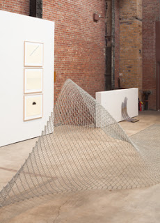
  The first piece of artwork that grabbed my attention was The Cyclone Fence, made in 1968. It caught my eye because it was huge and put in the middle of a warehouse.  The space was huge and you can fit almost anything in there. I think that having something so common in our daily lives be consider art through me completely off. The items I saw in this wear house it reminded me of construction work that is being done all over the place. It even reminds me of my back yard while we were remodeling the house.
      The next things that I saw were two wheelbarrows filled with water place in front of the service door to bring in the deliveries of the new artworks. At first I asked my self how the hell can two wheelbarrows filled with water be art? Than again art isn’t one specific thing I’ve answered my own question. I have a wheelbarrow in my home but I use it to carry heavy stuff I never let if get filled with water because it will get rusty.
       Another work of art that I found interesting is a barrel filled with water that over time looks dirty. It was placed on the lower level of the warehouse, which made it even creepier. It was located right under the stair case awkward place to put anything in my opinion. I really didn’t understand what the artist was trying to say with his art but I did enjoy seeing the different things you could do with every day items.
      This trip was pretty and so close to campus as well I didn’t know their was galleries around us so I found something new that I can show other people. 

The Cyclone Fence, made in 1968

 "Untitled" 1970
Steel barrel, Water


"Wheelbarrows with water"

Thursday, May 31, 2012

beauty is as old as our generations/ field trip #6


      On Thursday May 25th 2012 we went on our last field trip it was an adventure with all the rain and what not. But as the semester has come to an end the class has gotten harder and the reviews have been more connected to my life style. This week we went to the Metropolitan Museum of Art. It was a full house that day. 
         There were three main pieces that I just feel in love with. Which is the necklace by Kenneth Jay Lane, jewelry set by an unknown artist and a clip again by an unknown artist. These pieces were simply beautiful and all are white gold with beautiful diamonds. Such beautiful art work in the whole museum but what really caught my eye was the evolution on jewelry through out the years and generations. Theirs jewelry that are dated back to the 500 B.C that’s similar to the jewelry that a lot of people made from like jade stone really pretty. The works of art that I saw where of items that you could see this generation/ century owing because it’s so weird and well put.
The connection I see between all this art and the time it was created and know is that its all has one trigger in mind and its to be something beautiful to anyone eyes. There wasn’t one piece of jewelry that I believe this generation wouldn’t like. This field trip opened up my eyes and I notice that as for jewelry nothing has really changed threw out the years because it all means one thing beauty and class. Only thing that’s changed is how we create it.

Earrings (Clip)
Marshall Field & Co. (American, founded 1881)
Date: ca. 1985
Accession Number: 2008.190.11a, b


Jewelry Set
Date: third quarter 20th century
Accession Number: 2008.190.9a–c


Clip
Date: ca. 1950
Accession Number: 2008.190.14


Kenneth Jay Lane (American, born 1932)
Date: ca. 1980
Accession Number: 2008.190.18a–c


Ring
Date: fourth quarter 20th century
Accession Number: 2008.190.13


Earrings (Clip)
Kenneth Jay Lane (American, born 1932)
Date: ca. 1980
Accession Number: 2008.190.17a, b


Ring
Date: ca. 1965
Accession Number: 2008.190.46


Ring
Date: ca. 1970
Accession Number: 2008.190.49


Bracelet
Date: fourth quarter 20th century
Accession Number: 2008.190.138


Bracelet
Date: fourth quarter 20th century
Accession Number: 2008.190.139


Necklace
Date: 20th century
Accession Number: 2008.190.275a–c


Earrings (Clip)
Date: fourth quarter 20th century
Accession Number: 2008.190.299a, b


Necklace
Date: 500 B.C.–A.D. 900
Accession Number: 2008.190.317a–c


Vendôme & Coro (American)
Date: late 1950s
Accession Number: 1995.464.1a–c

Elsa Peretti (American, born Italy, 1940)
Date: late 1970s
Accession Number: 2008.190.137a, b


Wednesday, May 30, 2012

Chelsea Galleries Reaction field trip #5


Two weeks ago we went on a trip to the chealse galliers. We saw a mix of great items both good and not my taste. I’ve been the area before but I never really bothered to look into the stores. I didn’t think it was okay to just “Window shop” I saw manty different artist work and I fall in love with the Ernesto Nesto Exhibit I completely fell in love with his childish yet grown enough mindset.
The two artworks that I really enjoyed were actually in the Tania Bonakdar Gallery in the exhibition of Ernesto Neto: Slow is good.  When I first saw his artwork, it reminds me of a playground. However, what I really like is that everything in the gallery can be placed in the home. I feel as I could put this in a child’s play room and they can just run around all day. Also, all the artwork that I got to see was a very good investment because almost everything in there has a double function. It can be use a decoration. And second, people can place it in the playground for their children like The Island Bird, which is a humongous artwork that is hanging from the roof. I would love these pieces in my home one day.
On the other hand, there was artwork that I disliked. They are located in two different galleries. The first one was in the Gagosian Gallery with the exhibitions of Richard Avedon: Murals & Portraits. When I saw his artwork I didn’t like it because it didn’t move me maybe because I don’t understand its concept. I personality would not invest my money in this type of art. On the contrary, the other artwork was in the Gladstone Gallery that was exhibiting Anisk Kapoor's work I didn’t like this art yet again because it doesn’t speak to me. I like art that moves me that tells me a story that has more than one function and this didn’t do anything for me. Also, this work looks like it was done at fast paste and I don’t like rushed art. It looks sloppy to me. Similarly to the portraits of Avedon, I wouldn't invest any money on this artwork simply because it doesn’t seem to tell me a story like the other two do.
In conclusion in a far future in my life I would more than likely love to invest in a piece like the “Ernesto Neto: slow iis good. “The island Bird” I completely love that artwork. Also with “sound Way” that would be a great add-in to a child room or at a front door as well. It’s a beautiful piece of art. As I said nothing that was in any of the other galleries really spoke to me, I truly wasn’t moved because I like art that is both playful and tells me story and these other two artworks didn’t do that for me. 
Richard Avedon.
"Mural & Portraits."
1970.


Ernesto Neto: Slow iss good.
"sound Way."
2012.

Anish Kapoor.
"Ga Gu Ma."
2011-12.


Ernesto Neto: Slow iis good
"The Island Bird."
2012.


Tuesday, May 29, 2012

Quiz Make Up


            The artist Charles Atlas was an artist born in St. Louis, Missouri, in 1958.  His worked has been shown in a number of places.  His art is what I consider thinking outside the box with the human body.
             I completely feel in love with what he did with his photography for some odd reason I love the weirdness behind his art. I love the photo en-tilled “Bowery lip-synchs to Aretha Franklin's "Take a Look” the artist has a model wearing heavy make up while if u look close you’ll notice that His cheeks are pierced with metal ornaments, and he holds a set of oversized fake lips in his mouth. I think I like it simply because its weird and it something not a lot of artist do because not everyone like to look at art that is created like this. Charles Atlas doesn’t just take pictures he also does films that are weird but not the good weird more like the creepy weird. For example his filmed titled “Hail the New Puritan” I saw a clip of it and was freaked out. I like the colors he uses but why the dots everywhere makes me feel itchy. It brings back un-wanted memories of the chicken pocks.
          I think what this artist tries to show in his art the different ways a person can feel when just looking at a number of pictures and his variety of ways he can create some beautiful or weird. He’s a pretty cool artist/ filmmaker I like him and most of his work. If I could afford some of his work I would probably invest it in because its just art work that you can enjoy looking at and getting last in for a while. Not everyone will have the same view on the work as the person next to them in my opinion. 
Bowery lip-synchs to Aretha Franklin's "Take a Look”

                                       “Hail the New Puritan” 

Tuesday, May 1, 2012

Design in Our Lives(Field Trip 3)


              The designs in our life aren’t all highly functional some are low functional. But, every design has a propose in life even if its just to be used as décor or if its to have as prototype that could be improved.
            To low functional art designs that we have seen in the MOMA were the “design for an overpopulated planet” by Anthony Dunne. Also “Forks” by Bruno Munari are both low functional designs simply because it cant be used at the moment maybe never. Bruno Munari work on “Forks” is low functional because what he did to the forks although it is art make them unusable to a person in a normal everyday activity such as having a meal. Than the Anthony Dunne design had me very confused. I was looking at it and I didn’t understand its function at first. Than I read its description and I was able to understand it a lot more. Its function is to extract nutritional value from our surroundings. The point to this design was to show the shortage of food due to the fact that our plant is over populated. I consider its design to be low functional it doesn’t seem to useful in our society at the moment it looks like it could be used as a prototype.
            Very high functional designs are also apart of the MOMA like the “PUMA BIKE” form the puma Tribranded collection by Jens Martin Skibsted. It’s a bike that folds up small enough to be able to store in any small location. It’s also lighter than an average bike. I would love to own something like this myself. Seems to be pretty cool and an awesome prototype. Than there is the “CARNA Folding Wheelchair" by Kazuo Kawaski. It’s made with titanium, rubber and aluminum honeycomb. This design is cleaver. I consider it cleaver because the seat and backrest have balls that seem to act as support of the person who will be putting it in use. 
            Designs are important in life sometimes their functional and sometimes their just prototypes of a good idea.  We may see things as not being functional but that’s only because we don’t understand their actual functions due to the fact that we weren’t inside the designer’s head when they created it. We see high functional item’s functional because we see their function clearly. We understand what is going to work and what is not just by the way it looks.
            Everything we use in our life our life daily is coming from a basic design. Every phone, T.V., video game, is all basic design Designs help develop our world just like the designs in the MOMA one day they will help our world become a bit better. Each design just needs the function to become a bit clearer.

Title: "Design for an Overpopulated Planet: Foragers"2009
Artist: Anthony Dunne
Title: "Forks"1958
Artist: Bruno Munari

Title:" A Bike, from the PUMA Tribranded Collection"2004

Artist: Jens Martin Skibsted
Title: "Carna Folding Wheelchair" 1989
Artist: Kauzo Kawaski 


Thursday, April 19, 2012

Illustrate a Story


         This story is about a couple that met at the age of 15 and fall in love. Jacqueline, father got transfer in 1959to japan peter later said he joined the army just so he can go to japan and be with her. Peter did 3 years came back and visited jacqueline's mom to later find out she was married. she later realized that she made a mistake and started searching for him for 30 years until one day she called the operator at they had him listed in white plains. It amazes me to believe it that they still felt the same say they did when they were 15. This was a cute story that reflects how love never really dies its just takes 2 people who want to be together to make it work.